

Geelong Law Association Case Study

The Brief
GLA want to create meaningful connection with their highly valued members; also to support, engage and educate its law practitioners within the local Geelong community. The association wants to represent key values of respect, community, trust and empathy so local and outer communities can join the GLA relating to its values and feeling valued.
Geelong Law Association needed a new look. They wanted to reach out to the community they are proud to be apart of and have a brand that would match who they were as a company. In university I had the opportunity to re-brand their company.

As a practicing graphic designer I designed their new and exciting brand, including a new logo, patterns, style-guide, social media components and website. I was given a
time-limit of 11 weeks. Even though it was used for a university assignment, it was still great experience to get feedback and learn how to work with a real brief.
Process
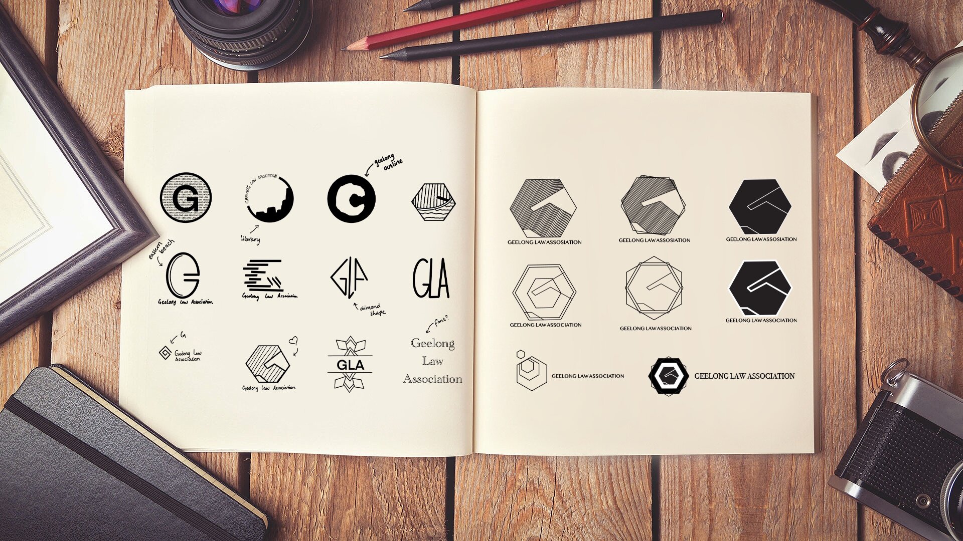


Improving the Design


• The hexagon relates to the Geelong Library, a symbol of Geelong
• The white lines are a representation of how people are connected through the business and in the community
• The design is a handshake that can also be interpreted
as a G. This represents the connection GLA has with its members.
• It has a modern typeface that reflects Geelong Law Associations professionalism
• Colours are of a cool tone that connect strong to
Geelongs colours and bring out the feeling of trust and loyalty
• Designed to be flexible in being used for variety of areas.


